Custom attributes
You can expand on Centra’s default information on accounts, customers, displays, orders, products, variants, product media, categories, campaigns and vouchers with additional information using custom attributes. Here's how to get started!
The configuration allows you to define custom attributes for the objects listed above. These attributes let you create custom fields that are accessible through the API and in exports. Multiple attribute types are supported to meet various needs, such as drop downs, booleans, multi select or text fields.
Storefront API provides a format for attributes that gives extended information about an attribute and its elements. Here’s a sample response:
{
  "attributes": [
    {
      "type": { "name": "sh_swatch" },
      "id": 10,
      "elements": [
        { "key": "desc", "kind": "INPUT", "value": "Dark green" },
        { "key": "hex", "kind": "INPUT", "value": "#8b0000" },
        {
          "key": "image",
          "kind": "IMAGE",
          "url": "https://.../client/dynamic/attributes/image_9471.jpg",
          "width": 60,
          "height": 60,
          "mimeType": "image/jpeg"
        }
      ]
    }
  ]
}
Setup
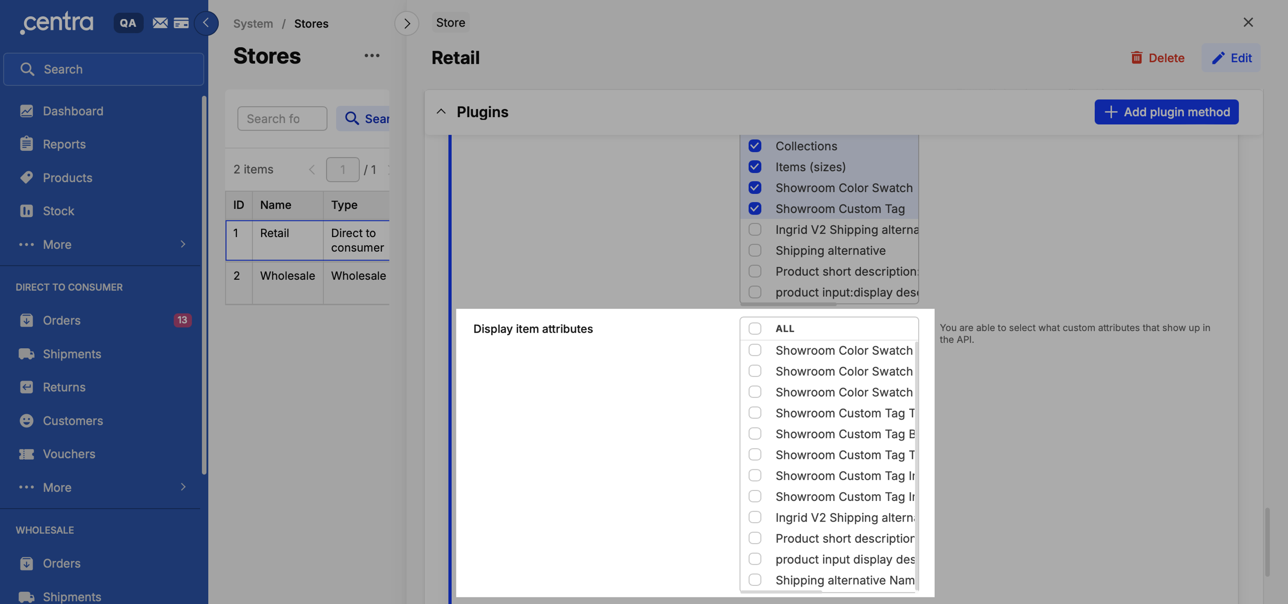
In order for your display item and order attributes to be available in the Storefront API you need to select them to the plugin.
You are able to select exactly what custom attributes that show up in the API, both on Display Items and as filters, you can do this in System=> Stores => your DTC GraphQL API plugin.
Just tick the boxes on the attributes you want to show:
Before we deploy
The config files are plain JSON—easy to read and tweak.
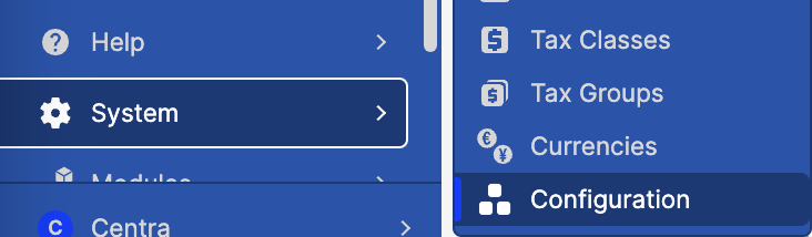
Go to System => Configuration.
If you can’t see it, it may be because you are not logged in as a full-access admin.
If you ever need a hand pushing the config to Production, Centra's staff has got your back. But first things first:
- Make your changes in a QA environment.
- Test the changes in the QA environment.
- Notify us that the config should be copied to production, Centra staff will import the new config to Production
Mapped and Dynamic attributes
Mapped attributes
A Mapped attribute on a product or variant is linked to an attribute object that can include metadata. This design is intentional and serves practical purposes.
For example, imagine you have a Color attribute that stores details like the name, hex code, and image of each color. Instead of re-entering this information every time, you create an attribute object for each color and link it to the relevant products.
Think of mapped attributes as predefined objects you can select and apply later, saving time and ensuring consistency.
The attribute configuration looks like this:
{
  "desc": "Color Swatch",
  "group": "variation",
  "readonly": "true",
  "elements": {
    "desc": { "desc": "Color", "type": "textarea" },
    "image": { "desc": "Image", "type": "image", "size": "60x60" }
  }
}
You can then create a new Color Swatch-attribute under CATALOG / ATTRIBUTES:
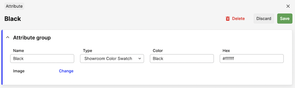
When this attribute is saved, this attribute option will be listed under the Color Swatch-title in the variant-section of the product:
Storefront API response:
{
  "attributes": [
    {
      "type": { "name": "color_swatch" },
      "id": 10,
      "elements": [
        { "key": "desc", "kind": "INPUT", "value": "Dark green" },
        { "key": "hex", "kind": "INPUT", "value": "#8b0000" },
        {
          "key": "image",
          "kind": "IMAGE",
          "url": "https://.../client/dynamic/attributes/image_9471.jpg",
          "width": 60,
          "height": 60,
          "mimeType": "image/jpeg"
        }
      ]
    }
  ]
}
Dynamic attributes
Dynamic attributes are in comparison to mapped attributes not linked to any pre existing attribute, but do have specific data for the individual items such as products, categories or other entities. This data needs to be set for each product instead of linking to an existing attribute. For example, a dynamic order attribute can be used to store the external ID of an order as recorded in another system. Since this value varies for each order, defining it as a mapped attribute wouldn’t be practical.
The difference between mapped and dynamic is that dynamic uses "readonly": false for the attribute.
It used to be that if you had "readonly": false on the attribute, only the element with the text key would be visible in the API. This meant that if you needed multiple elements you needed multiple attributes as well. To keep with the previous behavior, this is still the case for single-element attributes. For dynamic attributes with multiple elements, every element will now be returned in the API as [attribute-name]-[element-name]. Storefront API always returns full attribute data.
{
  "desc": "Promotion",
  "group": "product",
  "readonly": false,
  "elements": {
    "sale": {
      "desc": "Limited Edition",
      "type": "boolean",
      "options": [
        ["0", "No"],
        ["1", "Yes"]
      ]
    },
    "preorder": {
      "desc": "Promotion",
      "type": "boolean",
      "options": [
        ["0", "No"],
        ["1", "Yes"]
      ]
    }
  }
}
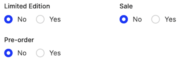
These will show up on the product directly with a Yes / No-option:
Storefront API response:
{
  "attributes": [
    {
      "type": { "name": "pr_promotion_boolean" },
      "elements": [
        {
          "key": "sale",
          "kind": "BOOLEAN",
          "value": { "name": "Yes", "value": "1" }
        },
        {
          "key": "preorder",
          "kind": "BOOLEAN",
          "value": { "name": "Yes", "value": "1" }
        }
      ]
    }
  ]
}
Please note that when the option you've selected is 0/false the property will not show up in the API at all in some APIs.
Attribute groups
The group on the attribute specifies where the attribute should be placed. The following groups exist today:
| Group | Description |
|---|---|
product | Listed under General Attributes on all Products. |
variation | Listed under each Variant on all Products. |
display | Listed on each product display |
order | Listed on each Order. |
customer | Listed under each Customer. |
account | Listed under each Account (Wholesale). |
sizechart | Listed under each size in a size chart. |
product_media | Listed under each image in Centra backend. Assignable through Integration API. |
category | Listed under Category Information on categories. |
voucher | Listed under each Voucher. Assignable through Integration API. |
campaign | Listed under each Campaign. |
Attribute element types
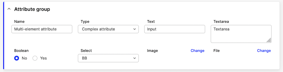
Inside the elements property of the custom attribute, you can define the actual types that will be used to store the attribute data:
{
  "desc": "This is the attribute",
  "group": "product",
  "elements": {
    "Text": {
      "desc": "This is the element-type",
      "type": "boolean",
      "options": [
        ["0", "No"],
        ["1", "Yes"]
      ]
    }
  }
}
The following element types are available today. However, not all of them are supported for Dynamic attributes, which are displayed inline for each entity. The table below outlines the supported options.
| Type | Look | Support | Options |
|---|---|---|---|
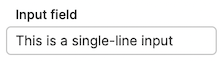
input | 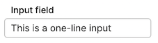 | Mapped/Dynamic | One-line text field |
textarea | 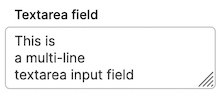 | Mapped/Dynamic | Multi-line text field |
readonly |  | Dynamic | Allows a field without the ability to edit it. Used for showing IDs or things that should not be changed. |
boolean |  | Dynamic | Options for the radio inputs (default is always 0): 'options' => [['0','No'],['1','Yes']] |
select | 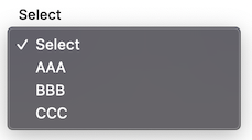 | Mapped/Dynamic | Default selected is always first option, so keep it as ['0','Select'] |
image | 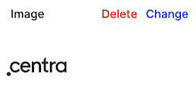 | Mapped | Size of the image: 'size' => '600x400'. Allowed image formats: JPG, JPEG, PNG, GIF, SVG |
file | 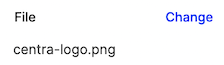 | Mapped | No options available |
Attributes with multi-select value
Selectable mapped attributes can be configured so that multiple values can be selected at once. This is achieved by adding parameter 'multi' => true to the attribute. For example, a multi-choice Label attribute can be configured like this:
{
  "desc": "Label",
  "group": "variation",
  "readonly": true,
  "multi": true,
  "elements": { "name": { "desc": "Label description", "type": "textarea" } }
}
In Centra, the attribute will look like this:
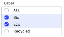
Storefront API response:
{
  "attributes": [
    {
      "type": { "name": "var_label_multi" },
      "id": 64,
      "elements": [{ "key": "name", "kind": "TEXTAREA", "value": "Bio" }]
    },
    {
      "type": { "name": "var_label_multi" },
      "id": 65,
      "elements": [{ "key": "name", "kind": "TEXTAREA", "value": "Eco" }]
    }
  ]
}
Please note that each selected value is returned as a separate object in Storefront API.
API Output
The API output differs between Dynamic and Mapped attributes.
Mapped attributes will always have a parent element named as the attribute-key. This is how the elements look like from the mapped attributes:
{
  "desc": "This is the attribute",
  "readonly": true,
  "group": "product",
  "elements": {
    "text": { "type": "Input", "desc": "Text" },
    "textarea": { "type": "textarea", "desc": "Textarea" },
    "boolean": {
      "desc": "Boolean",
      "type": "boolean",
      "options": [
        ["0", "No"],
        ["1", "Yes"]
      ]
    },
    "select": {
      "desc": "Select",
      "type": "select",
      "options": [
        ["0", "Select"],
        ["first", "First Option"],
        ["Second", "Second Option"]
      ]
    },
    "image": { "type": "image", "desc": "Image", "size": "600x400" },
    "file": { "type": "file", "desc": "File" }
  }
}
Storefront API response:
{
  "attributes": [
    {
      "type": { "name": "pr_mapped" },
      "id": 61,
      "elements": [
        { "key": "text", "kind": "INPUT", "value": "Text" },
        { "key": "textarea", "kind": "TEXTAREA", "value": "Textarea" },
        {
          "key": "boolean",
          "kind": "BOOLEAN",
          "choiceValue": { "name": "Yes", "value": "1" },
          "choiceValues": [
            { "name": "No", "value": "0" },
            { "name": "Yes", "value": "1" }
          ]
        },
        {
          "key": "select",
          "kind": "SELECT",
          "choiceValue": { "name": "Second Option", "value": "Second" },
          "choiceValues": [
            { "name": "Select", "value": "0" },
            { "name": "First Option", "value": "first" },
            { "name": "Second Option", "value": "Second" }
          ]
        },
        {
          "key": "image",
          "kind": "IMAGE",
          "url": "https://.../client/dynamic/attributes/image1_4265_png.jpg",
          "width": 600,
          "height": 400,
          "mimeType": "image/jpeg"
        }
      ]
    }
  ]
}
Dynamic attributes
Remember that only the element with the key text will be shown and only if the value is not 0/false in some APIs.
Example of an input field:
{
  "desc": "This is the attribute",
  "group": "product",
  "readonly": false,
  "elements": { "text": { "desc": "Text", "type": "input" } }
}
Storefront API response:
{
  "attributes": [
    {
      "type": { "name": "pr_dynamic" },
      "elements": [
        { "key": "text", "kind": "INPUT", "value": "This is the text" }
      ]
    }
  ]
}
Media object attributes.
Configuration of an example dynamic attribute for product media of type caption:
{
  "desc": "Image caption",
  "group": "product_media",
  "readonly": false,
  "elements": { "value": { "desc": "Caption", "type": "input" } }
}
Storefront API response:
{
  "media": [
    {
      "thumb": {
        "url": "http://localhost/client/dynamic/images/1_9adfeff6f2-red.jpg",
        "mediaSize": { "name": "thumb" }
      },
      "attributes": [
        {
          "type": { "name": "img_caption" },
          "elements": [
            { "key": "value", "kind": "INPUT", "value": "Example caption" }
          ]
        }
      ]
    }
  ]
}
The dynamic attribute element types supported are all returning simple strings, so they look the same as per above.
Examples
We recommend using snake_case for all your custom attributes API names. Because Centra uses camelCase, attribute values are mixed up in most API responses - the Storefront API is the only exception. Using snake_case provides immediate visual distinction for custom fields and prevents the risk of accidentally reusing an existing system attribute name.
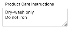
Product care instructions
A multi-line dynamic text field for entering additional information about the Product. Can also be set up on the Variant level (group => variation).
{
  "desc": "Product Care Instructions",
  "group": "product",
  "readonly": false,
  "elements": {
    "text": { "desc": "Product Care Instructions", "type": "textarea" }
  }
}
This displays like this:
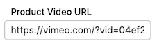
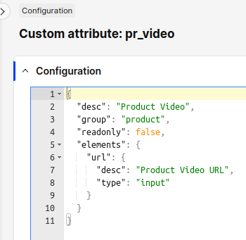
Product video
Since products videos will be different on each product, we use a dynamic input field to store video URL
{
  "desc": "Product Video",
  "group": "product",
  "readonly": false,
  "elements": { "url": { "desc": "Product Video URL", "type": "input" } }
}
This will look like this in the Product page:
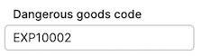
Dangerous goods
Required for certain products at customs. The requirements may vary depending on the product category and shipping destination.
This serves as a good example of a product attribute that includes an additional text field. However, this information will not be included in any documents related to the order. It may, however, be accessible to a 3PL (Third-Party Logistics provider) through the Integration API.
{
  "desc": "Dangerous goods",
  "group": "product",
  "readonly": false,
  "elements": { "value": { "desc": "Dangerous goods code", "type": "input" } }
}
It renders as a simple input field in the UI:
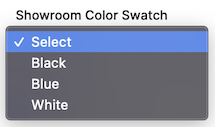
Color swatch
Remember, Variant-level attribute use group variation, not variant.
{
  "desc": "Color Swatch",
  "group": "variation",
  "elements": {
    "desc": { "desc": "Color", "type": "input" },
    "hex": { "desc": "Hex", "type": "input" },
    "image": { "desc": "Image", "type": "image", "size": "50x50" }
  }
}
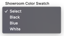
Swatch definitions need to be configured in Catalog -> Attributes:
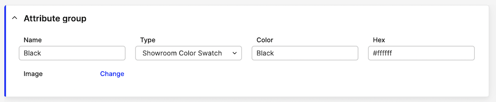
...and then selected on the Variant page:
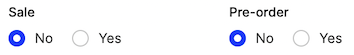
Sustainability Attributes Boolean (Yes/No)
Booleans are normally dynamic, not pre-defined. Remember, default value(s) (index 0) will not be returned in the API.
{
  "desc": "Sustainability Attributes",
  "group": "variation",
  "readonly": false,
  "elements": {
    "sale": {
      "desc": "Eco-Friendly",
      "type": "boolean",
      "options": [
        ["0", "No"],
        ["1", "Yes"]
      ]
    },
    "preorder": {
      "desc": "Non-Toxic",
      "type": "boolean",
      "options": [
        ["0", "No"],
        ["1", "Yes"]
      ]
    }
  }
}
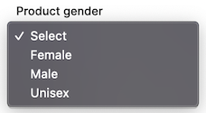
Product gender
The difference between this and Static attribute is that the select options cannot be adjusted/expanded without a code change.
Please notice, the keys are enums, not integers. Use ['0','Select'], not [0,'Select'].
{
  "desc": "Product gender",
  "group": "product",
  "readonly": false,
  "elements": {
    "value": {
      "desc": "Product gender",
      "type": "select",
      "options": [
        ["0", "Select"],
        ["female", "Female"],
        ["male", "Male"],
        ["unisex", "Unisex"]
      ]
    }
  }
}
The select then looks like this in the UI:
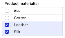
Product material - multi-select
For attributes which are pre-defined, multiple values can be made selectable at once.
The multiple values can be set up in Centra following the instructions [here](https://support.centra.com/centra-sections/general/product/attributes#how-to-access-the-attributes-page).
{
  "desc": "Product material(s)",
  "group": "product",
  "readonly": true,
  "multi": true,
  "elements": {
    "name": { "desc": "Material name", "type": "input" },
    "description": { "desc": "Material description", "type": "textarea" }
  }
}
Multi-select snippet looks like this in Centra:
Product display additional text
You can also define custom attributes on a display level:
{
  "desc": "Extra text",
  "group": "display",
  "readonly": false,
  "elements": { "name": { "desc": "Extra text", "type": "input" } }
}
This renders like this:
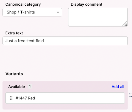
Product media attribute
This functionality allows you to enhance already existing product media with additional metadata with extra information, in this case text.
You can add text-based attributes to existing product media uploaded via Catalog -> Product -> Variants. These media-level attributes are currently not translatable.
Let's take this example, where we would like to store the height (in cm) of the model posing in the picture:
{
  "desc": "Model Size (cm)",
  "group": "product_media",
  "readonly": false,
  "elements": { "value": { "desc": "Model size (cm)", "type": "input" } }
}
This renders under each Image details, when you click the image in AMS backend, as:
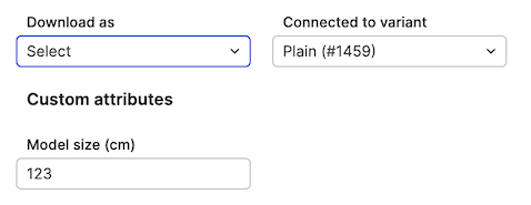
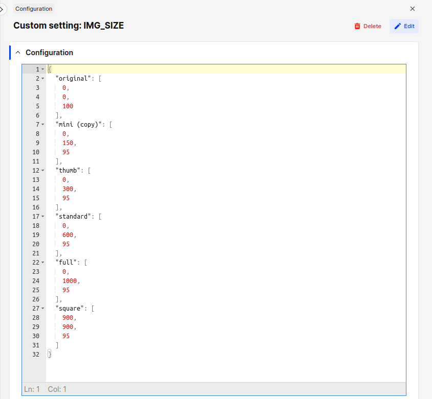
Image sizes
Centra includes a set of predefined image dimensions used to generate multiple versions of uploaded images. If additional dimensions are needed, you can set them up using the configuration.
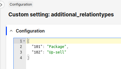
Custom relation types
Learn how to configure custom display relations in our FE guide.
Relation types have been moved from the PRODUCT section to a separate entry.
New config: Please note, that there are some predefined image sizes that you cannot delete. These are used by the system and are required to be present. You can edit them.
Custom attribute types
Learn how to configure custom attributes.
Every attribute type definition is editable separately. The configuration structure remains the same.
New config:
You may notice that there is no Edit button on some attributes. These are not custom types, but belong to plugins. For example, if you have a Google Merchant or Facebook Feed plugin, you will see six attributes they define.
Modifying attributes
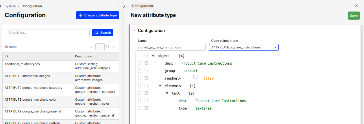
You can update and delete existing attribute definitions, and add new ones.
Attribute type names are restricted to letters, digits, underscore _ and minus sign -. You cannot change the type name, but you can clone an existing attribute into a new one. Just click on the Create attribute type button and pick an existing attribute type to duplicate, then edit this copy.
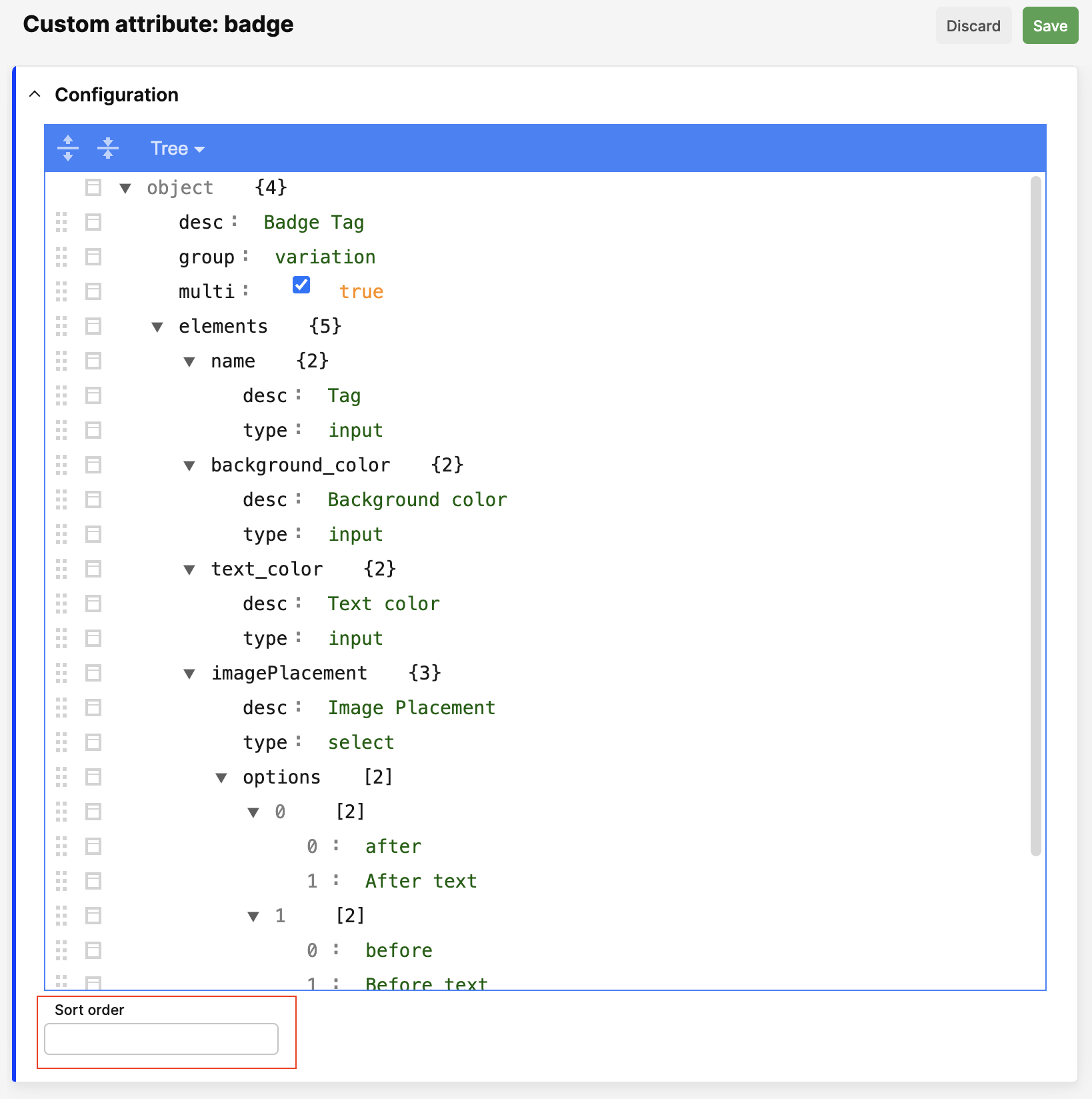
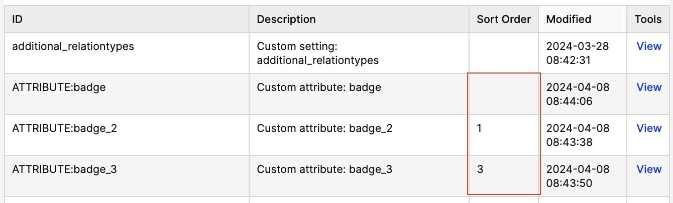
Custom sort order
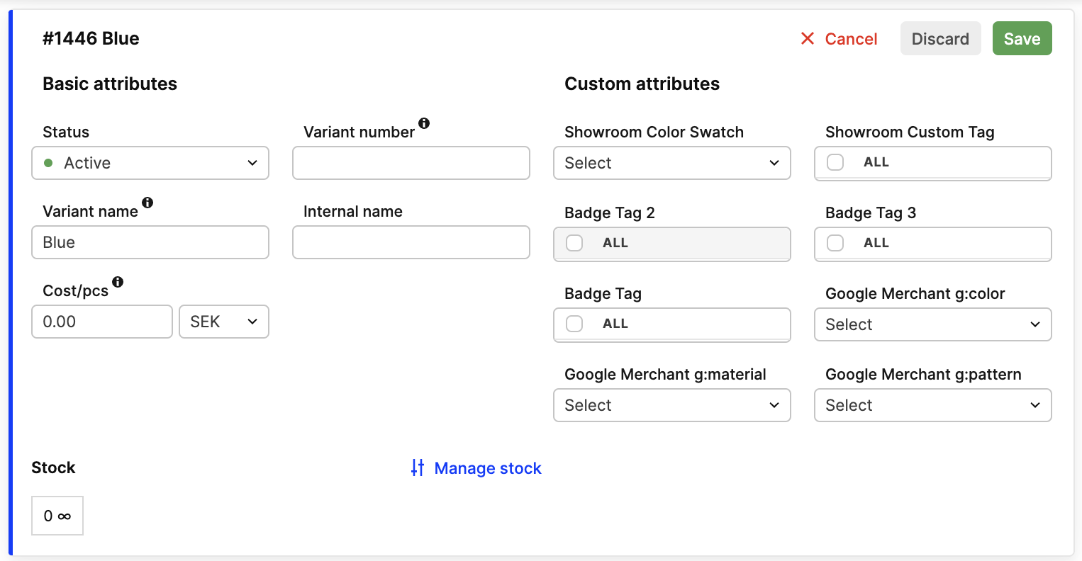
By default, we sort custom attributes alphabetically. If you want to change the order, you can use a Sort order field to the attribute definition. Please note that you can change it only on editable attributes. The lower the number, the higher the attribute will be in the list. Predefined attributes are always sorted last.
Remember that empty Sort order is not treated as 0. It is treated as null, and the attribute will be sorted alphabetically after attributes with numeric sort order.
Fields in the attribute definition is placed under the main configuration:
Configuration list before change:
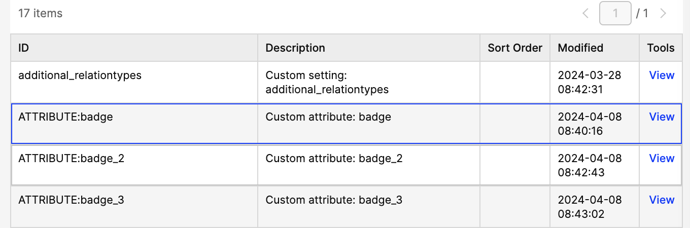
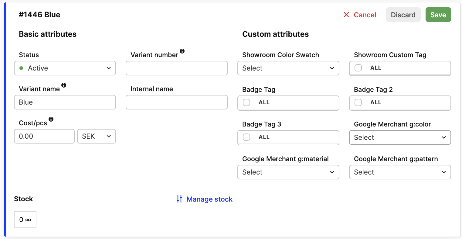
Product variant before change:
Configuration list after change:
Product variant after change:
Broke something?
In case something did not work as well as you expected, contact us to help you restore the previous configuration.